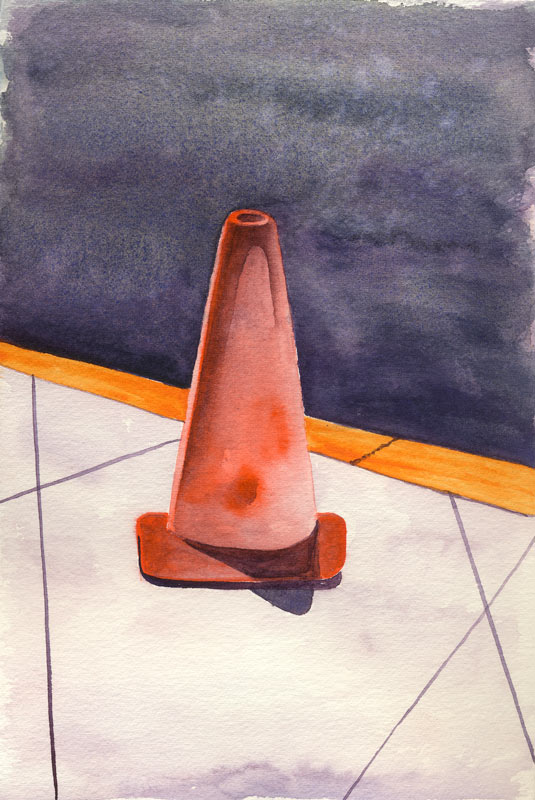
 Admittedly it is not yet summer, per the Sun, but it’s getting an early start with the amazing blue light that makes me giddy for a few weeks around the solstice every year. The sun is nearly at the zenith at noon, the air is boasting a cool fresh ocean breeze scented with magnolia blossoms, and as I sat drinking all this in, the most colorful thing to be found in corporate landscaping was sitting there right in front of me.
PO73
Inktober 2016: Oct 31 – Candy Corn
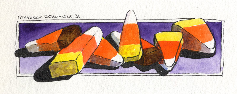 And now, the last and final drawing of Inktober 2016. Some allergy has gotten the better of me lately, and if there hadn’t been a challenge on, I would probably have blown it off and gone to bed early. It’s been such a great month though! I couldn’t possibly let the last day go by without a sketch to commemorate the end.
So here it is, simple and seasonal and fun. This is my new best friend the Kuretake #40 Ink Brush and a few paints you’ve seen before: the orange team PO73/PO62, PY154 yellow, PV23 and burnt umber. Thanks to everyone who favorited and retweeted these, and especially @slczouk and @TheresaHaworth on Twitter for drawing through it with me. I would have probably fizzled out half way through except for you!
Now, at the suggestion of @GMTminus7, next month is going to be Morevember. I’m glad she said it, because I can’t stop anyway. Ink and wash is far too much fun to quit!
Inktober 2016: Oct 30 – The Monument
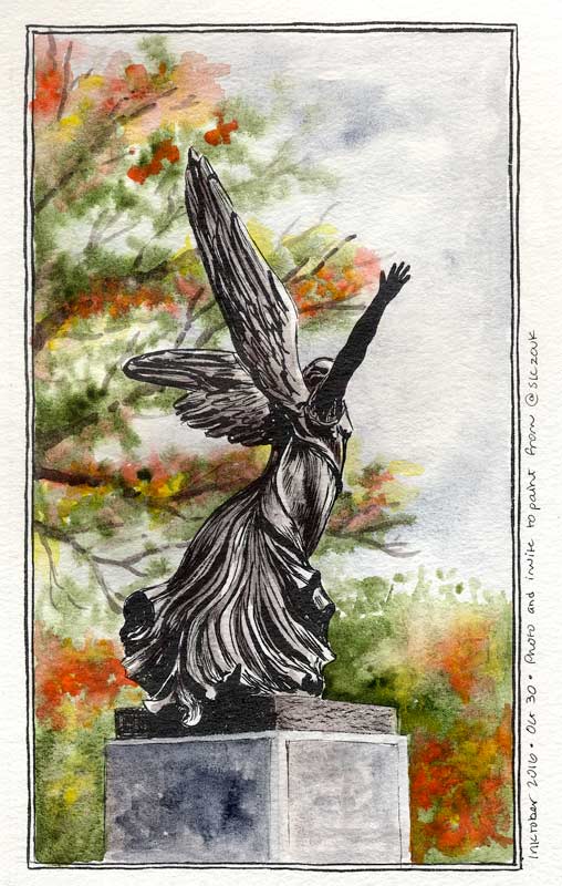 This is painted with permission, and an invitation, from @saraofwhimsy – link goes to the lovely photo she posted on Twitter. (Thanks, Sara!) All those swirls in the angel’s dress were irresistible! Like all the Inktober pieces, I went in cold with the ink, no preliminary pencil lines. There have been a few mishaps regarding proportion this month, so I watched carefully to make sure everything fit together, and that the whole statue fit on the page. The dress swirls are reasonably true to the ref – I went a little more freestyle in the wings, just to get it done in one evening.
Ink courtesy of the Kuretake #40 ink brush. (The cartridge ran out part way through, which was a very happy accident. The bristles were sufficiently ink-less for some nice drybrush texture on the monument base.) The statue is toned with Daniel Smith’s Bloodstone paint. I usually don’t like it, but here it offered just the right tint of color to give the statue a little character. The base is a combo of Bloodstone and Sodalite; trees are Green Apatite with touches of PO73, PO62, and PY154 for the fall leaves. Sodalite again in the sky. About 8.5″ x 4.5″ on Strathmore Windpower 140lb CP.
Inktober 2016: Oct 16 – Garibaldi
 Garibaldi are the largest members of the Damselfish family, which surprised me. I’m only familiar with the smaller damselfish commonly found in people’s aquariums. Apparently Garibaldi are easy to find if you’re diving or exploring the sea with a glass-bottom boat. It’s hard to imagine something so colorful inhabiting our local waters!
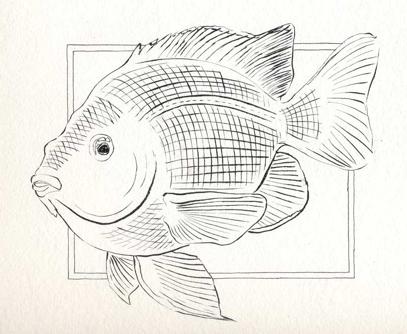 This time I thought to scan the fish before painting it. It’s the largest drawing of Inktober 2016 so far and possibly the largest thing I have drawn all year. Someone offered me knitted socks in exchange for a Garibaldi painting – I figured if she was going to work that hard, I had better do the same! This fish takes up the entire 9″ x 12″ page from the Windpower pad. I put down the base drawing with the Kuretake #40 ink brush using several reference images. Now, on to the paint! Read more
Inktober: Oct 15 – Black-Necked Stilt
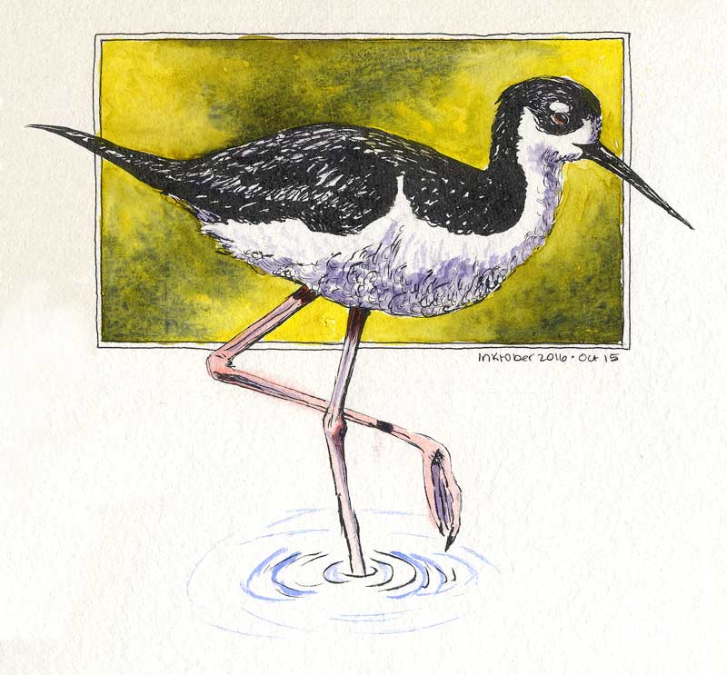 Now here’s a bird that lends itself to drawing with an ink brush! Black-Necked Stilts have ridiculously long legs. They’re long when the bird is in water; on land, it looks like they have legs that were meant for different bird. Most of the time, they’re in enough water to look proportionate (for a wader, anyway.) Read more
Inktober: Oct 14 – Garibaldi Fish
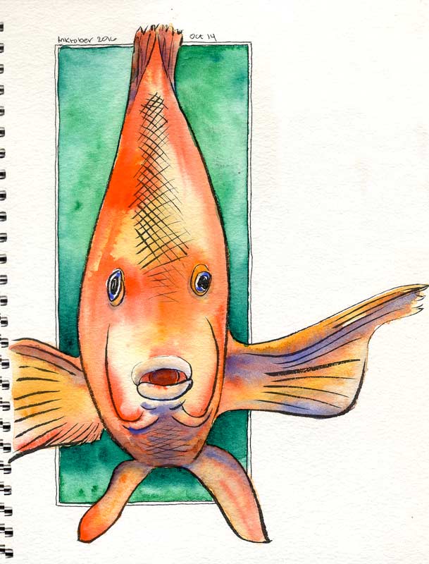 Someone suggested drawing these gorgeous fish that can be found off the local shores. Found a reference image in my favorite fish pose, and that sealed the deal!
I drew him too close to the spiral to get both fins, so left the spiral in the image, just to make sense of the half-fin. He’s made of PO62 Benzi Orange and PO73 Pyrrole, with Cobalt for the shadows. The background is both of the Phthalo greens, PG7 and PG36. Not pigments I use often, but the right choice here. I’m particularly pleased with the cobalt. Up close, there’s some beautiful interplay and texture where it pushed aside the orange pigment particles and flowed into the shadow areas.
PO73+PO62 is fast becoming my favorite orange. Benzi Orange by itself often hasn’t got enough depth, it’s more like a school-bus yellow than a true orange. PO73 Pyrrole is strident, but turns salmon pink in tints. In combination, they pack a powerful punch as a middle orange that stays true in the faintest washes. They’re especially nice when mixed on the paper, as I used them here.
Inktober: Oct 11 – Toco Toucan
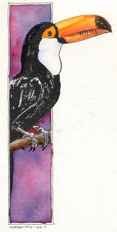 The crab left an odd gap on my page, so I found something that would fill it right up. The Toco Toucan gets the job done! He’s mostly ink, with some color obviously on the head, feet, and that incredible beak. (Funny thing about toucans. Their bills are large, but not very powerful. It can be hard for them to crunch up a grape!) This one has a wash of PO62 Benzi Orange on the eye spot and beak, with a further wash of PO73 Pyrrole Orange to deepen the color, and PB28 Cobalt Blue to give a little shadow. The feet are PB28/PO62 mixed on the paper. Finally, there’s a streak of PBr7 Burnt Umber on the branch.
Background is PV19 Rose Deep and PB16 Phthalo Turquoise. Those two are an odd combination and I hated it for a minute. The turquoise is far too green to normally make a good purple, and I should have known that. Fortunately it smoothed out into a decent-looking red-violet. Drawn with the Kuretake #40 brush.
Reference photo from Wikipedia.
Inktober 2016: Oct 7 – Blue Damselfly
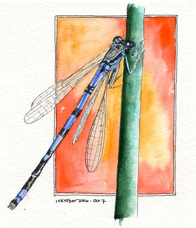 I was fascinated with these insects as a kid! Always wanted to catch them, but someone told me they would bite, so I rarely even tried. Probably a good thing for the poor bugs I believed that tale!
Apparently this is a European damselfly, Enallagma cyathigerum. I would have seen Familiar Bluets, Enallagma civile. They’re all gorgeous, and always a treat when one lands nearby. This sketch began plein aire, since a Bluet landed while I was sketching the Bird of Paradise a few days ago. Of course it flew off a few seconds later! I found a photo taken from a similar angle and finished it up for Day 7. Not sure I love the Jadeite on the plant stem, but pretty happy with the rest of it.
TIL: Damselfly heads are really complicated! After finishing I realized that it actually has five pieces: two eyes of course, and three apparent sections between the eyes. In the ref, the left eye is nearly hidden. In the drawing, I sort of mixed up the left eye and the sections of the upper head. Might have to draw a damselfly head study to make up for my carelessness.
Inktober: Oct 4 – Bird of Paradise
 I think I’m in love with pen and ink.
This Bird of Paradise was drawn, and mostly painted, on location at lunchtime. There’s loads of these in the corporate landscaping; I was able to grab a chair from the cafe patio and get into some detail. The backlit sepals looked like stained glass! Approx. 4″ x 7″, same paper/ink as the others.
The pen was running out of ink toward the end of this sketch, but held out until the finish. Painted the flower itself on location and laid in the background (and a couple of touchups) at home. I didn’t plan to go all Halloween with the purple and orange, but kind of glad I did. PV23 is so deep, it helps set off the glow from the fiery sepals. Think I got the backlighting right – that doesn’t always turn out as intended for me.
Courtyard People
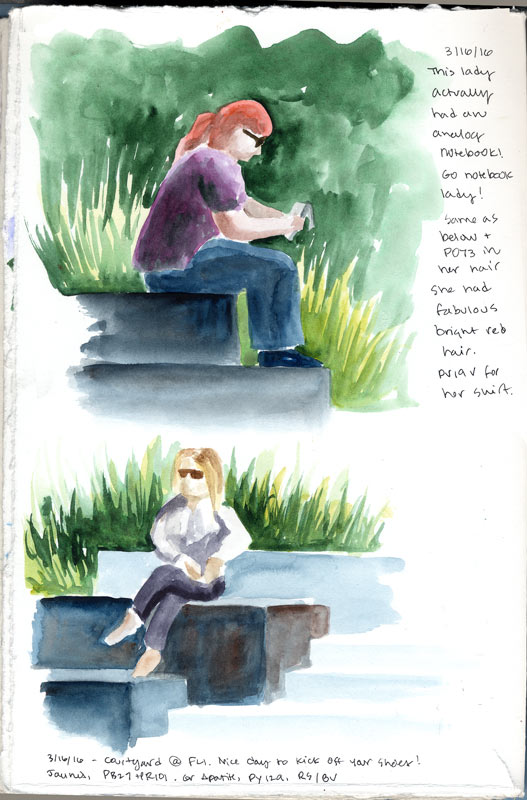 A nice day to kick off your shoes! That’s exactly what the second lady had done, enjoying some fine almost-spring weather. The corporate landscaping around here looks like giant kid’s blocks spilled everywhere. Most people sit on them and mess with their phones; amazingly I found two people to paint that were looking at something else. The upper woman had an old fashioned paper notebook and the lower was just staring into the clear blue sky. Saw another lady with an analog book. Banner day!
People are very much my weak point, especially proportions.