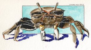
 This is a female Fiddler Crab. They’re not hard to find at aquarium stores, and I’ve had more than one as pets. Interesting creatures! The males have one very large claw that is waved about (to attract the females of course.) All of them are busy, curious, and entertaining as they prowl around their tank looking for food. Unfortunately, they’re usually sold as freshwater creatures. Read more
PBr7
Inktober: Oct 9 – Tibia Fusus
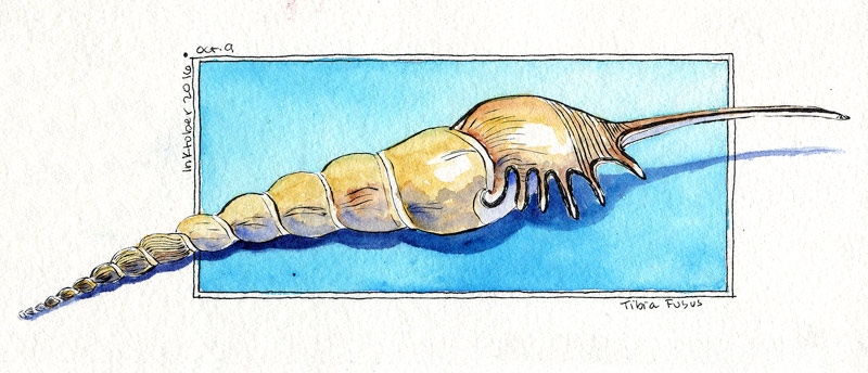 Here’s a Tibia fusus shell. These are one of my favorite shells! I placed one on the drafting table and drew it.
The background color is one of my favorite blues ever, which I rarely use because the paint fades so badly. No clue what pigment it is, was some very old Grumbacher Academie tube that has long since been thrown away. Just one well in my palette remains, trotted out for special occasions that don’t require lightfastness. Other paints used are Raw Sienna/Burnt Sienna (PBr7), Ultramarine PB29 in the shadows on the shell, and PB60 for the ground shadow.
Switched tools and drew this with the Kuretake #40 brush pen, same Carbon ink as before. 8″ x 2.25″ approximately.
Inktober: Oct 6 – Kestrel Portrait
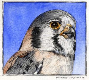 Love these birds! Saw one as a teenager and thought it was pretty cool to have a genuine Bird of Prey living right in my boring neighborhood.
Learned a couple things with this drawing. One, watch proportions! The head shape and eye size is a little different than the reference. It’s fine for practice, but not entirely *right*. Second, never use paint to do what you should have done with ink. I tried to get lazy and beef up one of the black neck stripes with Sodalite, and it just looked weird. Better to have just scratched away at it a little longer.
Third, perhaps, plan ahead. I was going to draw the entire bird and could see after a while that maybe 60% of him would fit on the page by the time I got done. Oops. Head portrait it is! This was about all I had time to draw anyway. Might do a full-bird drawing and stretch it over two days.
Reference is this Wikipedia photo.
Inktober: Oct. 3 – Keys
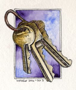 Think this sketch got a little dark! I put some keys on the drafting table and drew them, so it’s like a mini-still-life. They were reflecting a lot more light on the upper parts, which I darkened trying to get contrast between one and the next. Not the best choice, but oh well. That’s what this is about, practicing and improving.
PV23 and PB29 for the background, Raw Sienna PBr7 on the keys, with a judicious dash of PV23 in the shadows. PR101 on the key ring. About 3″ x 3.5″ with the same ink, paper, pen as the wren.
Inktober: Oct. 2 – Bob Tarte’s Sedge Wren
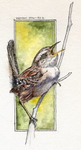 Today’s entry is a serenading Sedge Wren, drawn from Bob Tarte’s fabulous photo and used with his generous permission. Thanks Bob! Do check out his books and podcast at bobtarte.com.
Birdy at left drawn with the Platinum EF fountain pen on Strathmore 140lb Windpower CP.
Sentries
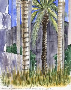 The queen palms serving as sentries for the mighty Date Palm. This is a favorite spot of mine in the landscaping, and these palms always seem so majestic. The viewpoint is a little below grade, from down among the blocks in the water feature. The decorative grasses are only about a foot tall, but I’m eye level to them here.
Laid out with the Kuretake #40 brush pen initially, then washed with color. The foremost palm frond and a few other points employ gouache, although the highlights on the date palm trunk are saved whites. Painted across the spread in my sketchbook.
Cobalt blue, green apatite, some PO62 to mute the blue and Jane’s gray mix for the background black glass building. The palm trunks are Raw Umber (with and without cobalt) and there’s a little PY129 and Naple’s Yellow among the greenery. Oh, and the shrubs are Jadeite. Nine pigments – no limited palette here! At least not for me.
Sketchbook #11: Il Fornaio again
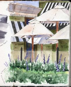 Here’s another take on Il Fornaio. This time I wanted to capture the forest of umbrellas that shade their enclosed patio. Didn’t even notice, until deep in the sketch, that one of the umbrellas was a different shape than the others. I used a bit of Bleedproof White with PV23 to lay in the flower blossoms over the background. It was tempting to add a few silhouette diners behind the glass, but something told me that would go too far and I’d ruin it. Decided to listen for once and stopped, so here it is.
Magnolia Blossom
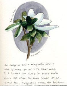 There’s magnolia trees outside at at work. There was also a magnolia tree next door to the house I grew up in. Without my realizing it, that aroma seeped its way into my memories each year and became the olfactory theme for for late spring/early summer.
The first spring at this building I walked out the front door and immediately found myself feeling like school was about to let out. It’s a wonderful feeling, even if I only get to enjoy it for a lunch break!
Il Fornaio, then and now
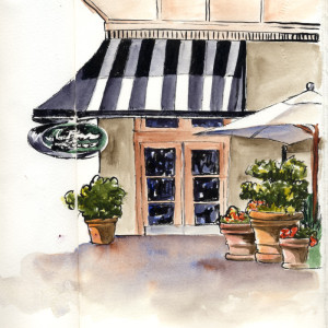 Thought I would take a break from the courtyard people and sketch this restaurant at lunch. It’s a sit-down place with a quick-serve sandwich shop off to one side – this is the door to the shop. I found a lovely shady spot on the open patio and soaked up some fresh spring air, and painted away.
Just for grins, take a look after the jump for my take on the same shop from early 2012. Read more
Starting to like ink!
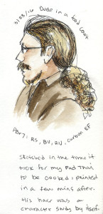 Here’s a sketch from my lunch break. The Platinum Carbon pen has been fascinating me, suddenly watercolor seems so much better with ink!!
Saw this guy in a food court, and his hair was a character unto itself. Fortunately he was also waiting for food, so I had time to sketch and paint him while my Pad Thai was cooking. One of the first faces I have attempted to draw in any detail.