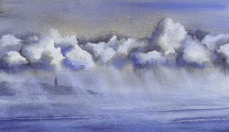
 That storm doodle sketch inspired me to try it again on a quarter sheet. Same two colors, same method, same laws of physics – totally different results! This is a cropped version, hiding a really prominent breaking wave at the bottom that was just bugging me as soon as I’d painted it.
The sketch was something I didn’t stress over and that spontaneity comes though in a good way. It also feels like a higher vantage point, like we’re on top of a hill and the breaking wave is far below. In this painting it’s like the viewpoint is at the water’s edge and the wave’s about to come hissing up the beach and soak me! It’s much too cold to get wet, so I had to deal with that.
Ended up toning it way down and at present, it looks OK. Does not draw too much attention to itself, the clouds are really the star which is what I wanted. My other regret is that I went with the lighthouse again, and didn’t place a distant container ship on the right instead. I could see one there, just getting hidden in the squall, but went with the lighthouse because I’d done it on the other painting. Missed opportunity. It would look a bit cheesy with both so I’m leaving it be, as a lesson learned. Still love the clouds though, so that’s a win! 11″ x 15″ on Arches Rough.