Inktober 2016: Oct 23 – Lesser Short-Nosed Fruit Bat Portrait

102316-inktober-fruit-bat-portrait
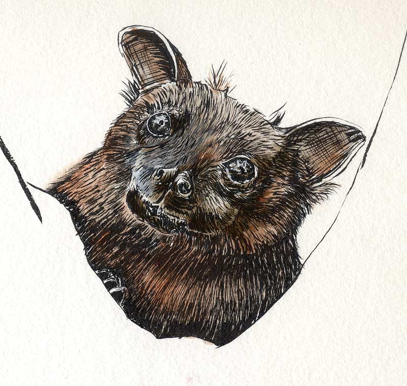
This is a Lesser Short-Nosed Fruit Bat. It’s a long name for a very appealing critter! I like bats in general, and didn’t know this one had such a lovely face. Their mammalian nature is very apparent in the doglike snout and (apparently) soft fur.

So far he’s been a joy to draw. Wings and a body to come!

Inktober 2016: Oct 22 – Azure Kingfisher Repair Job

101816-inktober-azure-kingfisher-fixedRemember the eye that was bugging me a few days ago? Well, I couldn’t stand it anymore!

After so many years of trying to be a watercolor purist, I finally realized that there’s no reason not to adapt a few things. There’s nothing wrong with opaque gouache, nor is there any reason why a given work has to be declared “done” at a given point and never ever touched again. This is a very freeing feeling, and I decided to exercise my new-found freedom on That Eye.

It took a little care, but ultimately wasn’t that hard to do. The Platinum Carbon ink did most of the work, as I knew it would. So, making the eye bigger and more oval was really not the problem. Recovering the lost catch light and the light rim that defines the lids, THAT was the problem. A few minutes with gouache and the problem was solved! It matched the watercolor perfectly and other than a slight difference in reflectance, looked as if it had been there all along.

So, Inktober Oct 22: One eye, a few blue highlights, and a big sigh of relief.


Inktober 2016: Oct 21 – Beach Rocks

102116-inktober-beach-rocksThis is one of my personal favorite drawings of the year, because it was done in the company of my bestest friend on the planet.

We only had a day together, a day that started far inland and needed to make up for all the years we’ve missed in just a few short hours. Thanks to the magic of an old truck and a tank of gas, we accomplished all that and so much more. Time has been hard on both of us, but this is an eternal friendship: it picks up where it left off, regardless of years or miles, never a beat missed.      Read more

Inktober 2016: Oct 20 – Leaves

102016-inktober-leavesA quick lunchtime plein aire of bright new leaves. Yes, that’s new leaves – no idea what kind of tree this is, but it makes new leaves and flowers in the fall. Whatever it is, it reminds me of an avocado tree, and the top of it is an easy target from my favorite space in the parking structure. Add some sunshine to backlight them, and I could not resist!

That rich color behind it is Daniel Smith’s Piemontite. Leaves are a combo of PY154 yellow and Green Apatite with a dash of Piemontite to pick up the “new leaf” redness visible on the brand-new foliage. It was first outlined with the Kuretake #40 ink brush, so I’m counting it in for Inktober.

Inktober 2016: Oct 19 – Common Yellowthroat

101916-inktober-common-yellowthroatThis rather silly-looking songbird came with an extra challenge. I met a friend for an impromptu lunchtime drawing session. We both wanted to paint the same reference, so I placed it upside down for me (right-side-up for her). Call me a show-off, but it solved the problem and we had a lovely time drawing and chatting. Thing is, I was working an upside-down bird upside down, Betty Edwards style.      Read more

Inktober 2016: Oct 18 – Azure Kingfisher

101816-inktober-azure-kingfisher
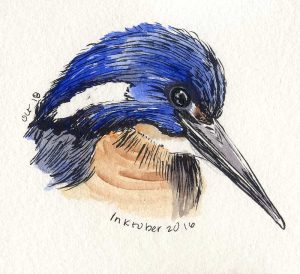
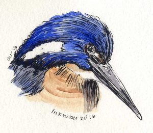
Here’s a bird I’d never heard of before: an Azure Kingfisher. They have the best birds in Australia! Clearly my life is not going to be complete until I’ve been there. If all I did was spend a day out seeing wildlife it would be a plane ride well spent.

Kingfishers have giant beaks as a rule, so this is actually fairly proportionate to the source photo. The color was just crying out for a strong dose of PB29 Ultramarine (in gouache) and some Burnt Sienna did a nice job on the bird’s warm breast. What I am not happy with is the eye – it’s not a bad eye on its own and would be fine on a songbird. This is an Azure Kingfisher though, and they have enormous beady eyes. A disappointing lesson in minding proportions! Letting it go for today, though with gritted teeth.

About 3″ x 4″ on the Strathmore paper, with the Kuretake #40 ink brush.

Inktober 2016: Oct 17 – Wet Grass

101716-inktober-grass-dropletsNot much to this sketch – it rained for the first time in months and I had to commemorate that somehow! These blades of grass had been intriguing me for weeks anyway. They were choking out the ornamental grasses in my favorite sketching corner. All of that dancing and waving in the breeze was making me want to draw them anyway; a few sparkly waterdrops finally made them irresistible. Approx 6.5″ x 4.5″ on Strathmore Windpower 140lb CP.

Inktober 2016: Oct 16 – Garibaldi

101616-inktober-garibaldi-for-carol-final Garibaldi are the largest members of the Damselfish family, which surprised me. I’m only familiar with the smaller damselfish commonly found in people’s aquariums. Apparently Garibaldi are easy to find if you’re diving or exploring the sea with a glass-bottom boat. It’s hard to imagine something so colorful inhabiting our local waters!

101616-inktober-garibaldi-ink-onlyThis time I thought to scan the fish before painting it. It’s the largest drawing of Inktober 2016 so far and possibly the largest thing I have drawn all year. Someone offered me knitted socks in exchange for a Garibaldi painting – I figured if she was going to work that hard, I had better do the same! This fish takes up the entire 9″ x 12″ page from the Windpower pad. I put down the base drawing with the Kuretake #40 ink brush using several reference images. Now, on to the paint!   Read more

Inktober: Oct 15 – Black-Necked Stilt

101516-inktober-black-neck-stilt-birdNow here’s a bird that lends itself to drawing with an ink brush! Black-Necked Stilts have ridiculously long legs. They’re long when the bird is in water; on land, it looks like they have legs that were meant for different bird. Most of the time, they’re in enough water to look proportionate (for a wader, anyway.)   Read more

Inktober: Oct 14 – Garibaldi Fish

101416-inktober-garabaldiSomeone suggested drawing these gorgeous fish that can be found off the local shores. Found a reference image in my favorite fish pose, and that sealed the deal!

I drew him too close to the spiral to get both fins, so left the spiral in the image, just to make sense of the half-fin. He’s made of PO62 Benzi Orange and PO73 Pyrrole, with Cobalt for the shadows. The background is both of the Phthalo greens, PG7 and PG36. Not pigments I use often, but the right choice here. I’m particularly pleased with the cobalt. Up close, there’s some beautiful interplay and texture where it pushed aside the orange pigment particles and flowed into the shadow areas.

PO73+PO62 is fast becoming my favorite orange. Benzi Orange by itself often hasn’t got enough depth, it’s more like a school-bus yellow than a true orange. PO73 Pyrrole is strident, but turns salmon pink in tints. In combination, they pack a powerful punch as a middle orange that stays true in the faintest washes. They’re especially nice when mixed on the paper, as I used them here.