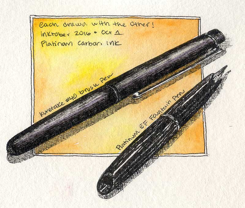
 It’s Inktober, and I am participating for the first time. To start, here’s my tools of choice! Not saying I won’t turn to another inking device at some point, but let’s start with these. I drew each item with the other, which turned out to be a good decision. The Kuretake #40 ink brush laid down some intense solid coverage to reveal the hard reflections on the shiny Platinum EF fountain pen. And, the EF pen brought on incredibly fine lines to capture the matte finish of the ink brush barrel. Real winners, both of them. Read more
PO62
Sentries
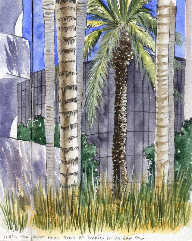 The queen palms serving as sentries for the mighty Date Palm. This is a favorite spot of mine in the landscaping, and these palms always seem so majestic. The viewpoint is a little below grade, from down among the blocks in the water feature. The decorative grasses are only about a foot tall, but I’m eye level to them here.
Laid out with the Kuretake #40 brush pen initially, then washed with color. The foremost palm frond and a few other points employ gouache, although the highlights on the date palm trunk are saved whites. Painted across the spread in my sketchbook.
Cobalt blue, green apatite, some PO62 to mute the blue and Jane’s gray mix for the background black glass building. The palm trunks are Raw Umber (with and without cobalt) and there’s a little PY129 and Naple’s Yellow among the greenery. Oh, and the shrubs are Jadeite. Nine pigments – no limited palette here! At least not for me.
Spring Weather
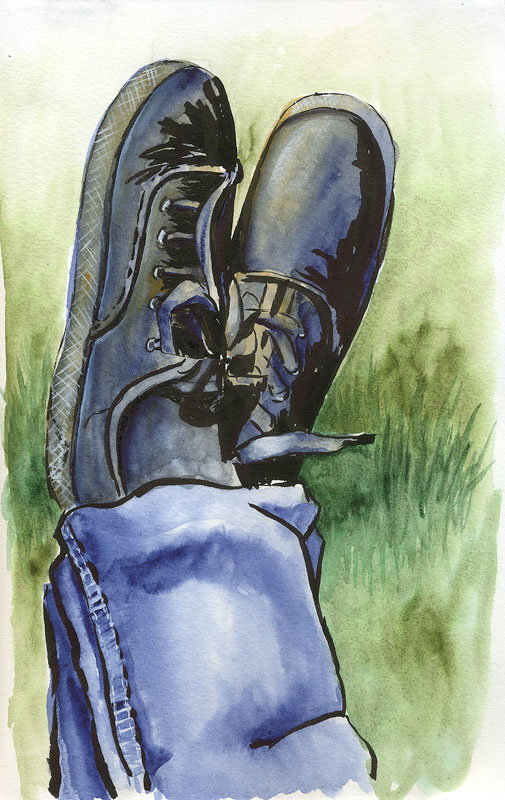 This is what kind of day it was outside today. Post-scanning, I realized that one of my feet looks like I’m wearing clown shoes. Ah well… this is what I get for diving in with an ink brush all come-what-may!
Jeans courtesy of PB60, Indanthrone Blue which I added to my palette this weekend. Painting on location demands speed, and I have come to rely more on using paint direct from the well (vs. mixing precise hues before applying to the paper). This might limit the hue range to whatever’s on hand, but drastically reduces the amount of time spent before brush hits paper. It also means there’s been an awful lot of people in my book wearing Prussian blue pants because I didn’t have a good “jeans” color on hand! As of yesterday, problem solved. Indanthrone is the best blue-jean-blue I know of, and makes a nice neutral with orange/brown as well. It gets a workout here, by itself and in combination with PO62 for the socks and shoes. Jadeite and Green Apatite were used for the lawn.
Is heaven any sweeter than Blue Jean?
Sunset Evening
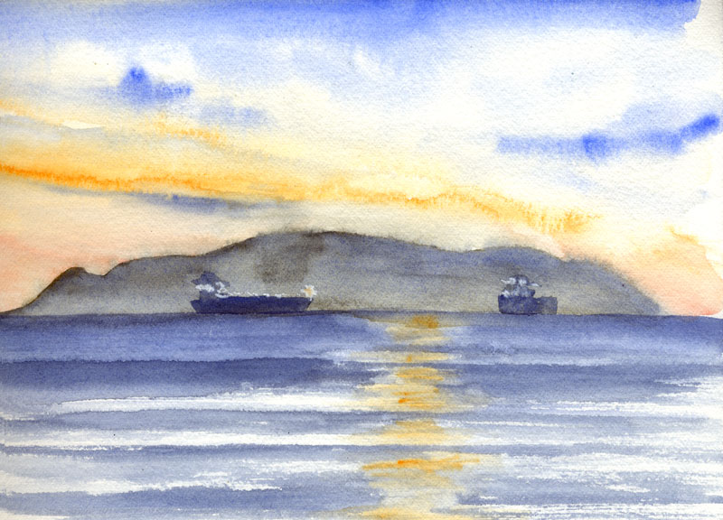 Ah, the tankers at sunset. Spent a lovely hour or two sketching while the sun went down. We were there late enough for the tankers’ lights to come on, so I dabbed those in with a bit of Bleedproof White. Otherwise, that’s cobalt, PO62, and a dash of PO73.
Tankers were not the only thing in view this evening – in addition to the usual birds and porpoises, I made friends with a beetle.
Read more
Behold the Sunbird
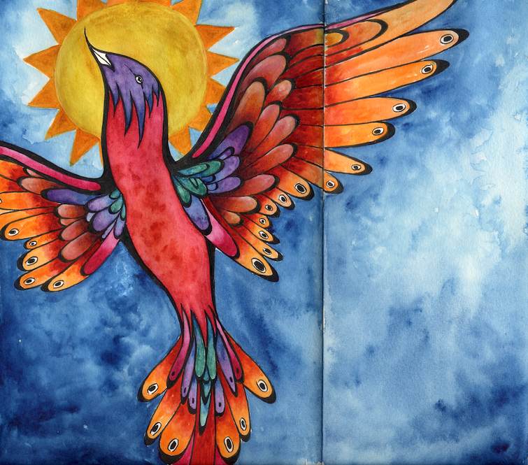 Had a color fit this week, painted across the spread in my sketchbook. The black lines are freehand drawn with a permanent brush pen, with watercolor and a few touches of white gouache.
On Winsor and Newton 90lb hot press, about 8″ x 10″. Paints used? Oh, goodness.
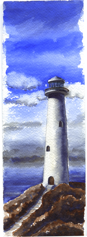
Another Lighthouse Paper Test: Fabriano Cold Press
 I find lighthouses are irresistible subjects when I want to test some paper… there is no better excuse to paint a sky!
This is some 140lb Fabriano Cold Press that I’m considering for the next sketchbook. Have been using various brands of 140lb rough for the last three books and decided to change it up a bit. I like using something different in each, keeps me from getting stagnant.
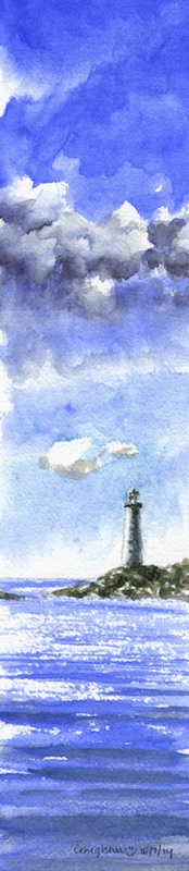
Lighthouse Paper Test
 Paper test! The first washes looked really good, so I decided to finish it up. PB28, PO62, and PBr7 Burnt Umber. It’s 12″ x 4″ on 140lb Fabriano Artistico Rough.
And yes, I love the paper!
Stormcloud Painting
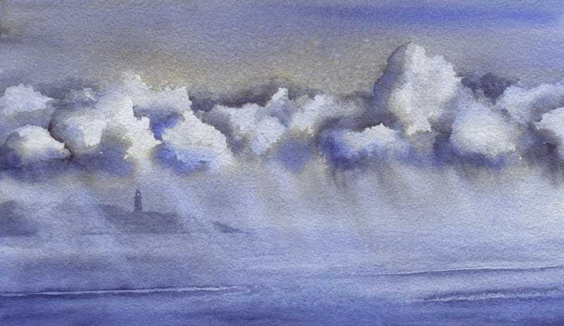 That storm doodle sketch inspired me to try it again on a quarter sheet. Same two colors, same method, same laws of physics – totally different results! This is a cropped version, hiding a really prominent breaking wave at the bottom that was just bugging me as soon as I’d painted it.
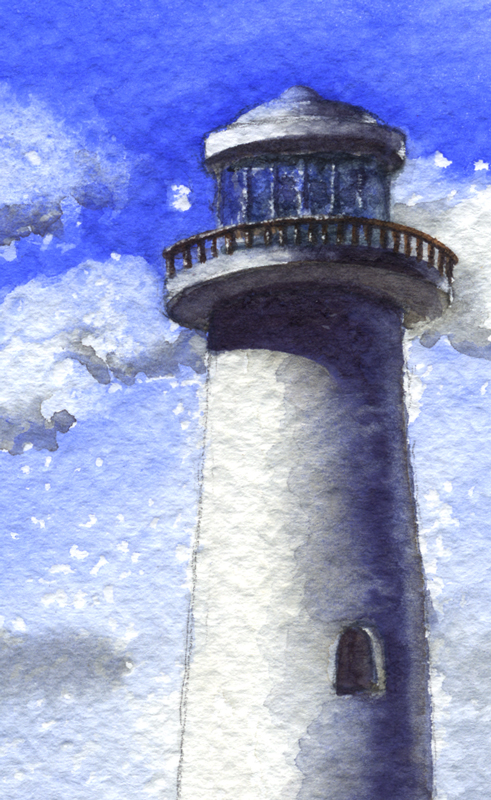
Stormcloud Doodle
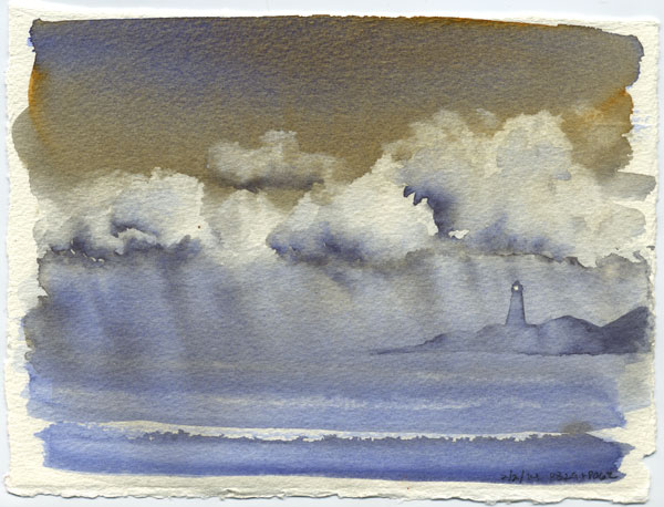 I was inspired by some stormclouds the other day and painted a sketch of them. PB28 Cobalt and PO62 benzimidazolone orange. Mostly washed on as pure color + let the laws of physics do the magic. (I did mix a little on the palette for the very deep accents in the clouds. ) Added the lighthouse after it was dry, I just couldn’t stop seeing one there so had to do it. About 5″ x 7″ on a loose piece of 140lb paper, probably the Richeson stuff I don’t really like. Worked well here though!