 Garibaldi are the largest members of the Damselfish family, which surprised me. I’m only familiar with the smaller damselfish commonly found in people’s aquariums. Apparently Garibaldi are easy to find if you’re diving or exploring the sea with a glass-bottom boat. It’s hard to imagine something so colorful inhabiting our local waters!
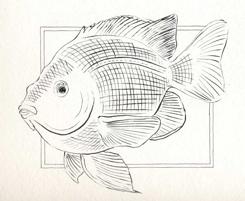 This time I thought to scan the fish before painting it. It’s the largest drawing of Inktober 2016 so far and possibly the largest thing I have drawn all year. Someone offered me knitted socks in exchange for a Garibaldi painting – I figured if she was going to work that hard, I had better do the same! This fish takes up the entire 9″ x 12″ page from the Windpower pad. I put down the base drawing with the Kuretake #40 ink brush using several reference images. Now, on to the paint!
On the previous Garibaldi, I loved the interplay between the Cobalt Blue (PB28) and the two oranges (PO73 Pyrrole Orange and PO62 Benzi Orange.) I went for the same effect here, and – as often happens with watercolor – achieved entirely different results. This time, instead of getting discrete areas of Cobalt spreading among the oranges, I got a dull shadow orangey-gray. Curses! But I should have seen this coming. PO62/PB28 is one of my favorite neutral-complement pairs, and it’s a combination that’s made many a stormy sky for me via blending them together on wet paper. I can’t explain why the blue fanned out through the orange on the other painting. It did though, and this time it blended the way it always does, into a gray. Well, live and learn. I was disappointed, but finished up and decided to sleep on it before declaring it “done”. It didn’t look too bad, but I wasn’t sure it looked too good, either.
Next morning, I was firmly in the “not good” camp. Despite all the orange washes, the fish was just pale, kind of sickly looking actually. The dull areas just added to the effect. Problem is, I had already placed the light blue spots. Now, I had to either redo the orange washes while working around the dots, or go out and buy masking fluid to protect them from being washed away in an onslaught of orange. Neither sounded good. I half-heartedly wiped a little PO73 on the fish’s dorsal area, working carefully around the dots, and to my surprise it looked pretty good. Working wet-on-dry allowed me the control I needed, and I could still do a lost-and-found edge to prevent a hard line where this color faded along the fish’s lateral line. Now we’re talking! I worked more PO73, and some occasional PO62, around the fish’s belly, face, tail and fins. A few discreet touches of cobalt flowed a little more like I had wanted, giving much more vibrant shadows. Finally it was pretty much complete, except for one thing. The tail just needed a little something. I struggled with this for a minute, dying to do it but worried that I was about to go overboard and ruin it all. Decided to chance it, and lifted out some highlights. That was it! I could let it rest now, happy with the richer color. The pearlescent paint on the dots sparkled, and the deep background offered just the right contrast to set it all off. Finito!
Good news, my trading partner was happy with it too. I’ll soon be sporting some hand-knitted purple-striped socks, and she’ll have a bathroom with a bossy orange fish to keep everyone in line. Not a bad trade for an evening’s work!