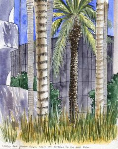
 The queen palms serving as sentries for the mighty Date Palm. This is a favorite spot of mine in the landscaping, and these palms always seem so majestic. The viewpoint is a little below grade, from down among the blocks in the water feature. The decorative grasses are only about a foot tall, but I’m eye level to them here.
Laid out with the Kuretake #40 brush pen initially, then washed with color. The foremost palm frond and a few other points employ gouache, although the highlights on the date palm trunk are saved whites. Painted across the spread in my sketchbook.
Cobalt blue, green apatite, some PO62 to mute the blue and Jane’s gray mix for the background black glass building. The palm trunks are Raw Umber (with and without cobalt) and there’s a little PY129 and Naple’s Yellow among the greenery. Oh, and the shrubs are Jadeite. Nine pigments – no limited palette here! At least not for me.
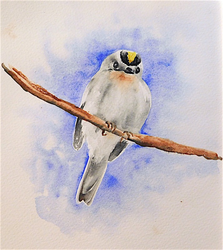 Friends on Twitter pointed out that it’s #NationalBirdDay – in honor of aves everywhere, here’s a Golden Crowned Kinglet. This is painted from a Wikipedia ref, though I promise you I saw several of these clearing the trees of bugs this very afternoon.
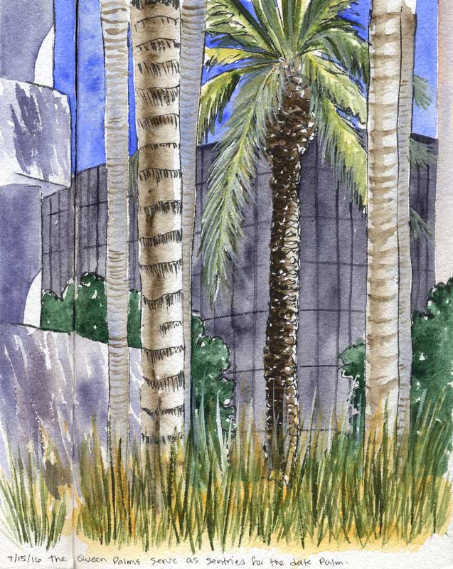

.jpg)