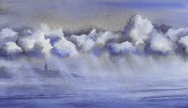
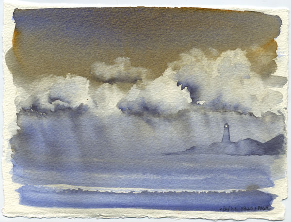
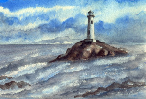
 This sketch started around Christmas as an exercise in painting water, and was supposed to be a boulder in a wild running stream. I put down the boulder and the Kyanite (the silvery-gray color) then got bored and moved on.
This week I decided that I was never going to paint the riverbank above the rock, so used the blank top half to practice a cerulean sky. This made the water look like the sea, except it needed a reason to be reflecting all that gray! That led to a storm moving in. A Monthly Challenge on WetCanvas.com, plus a film I’d seen, got me thinking about lighthouses. There was no reason why the boulder couldn’t be a small rocky island, so made a few adjustments, and there we are.
This is just a wee bit brighter IRL, but not much… there’s sort of cool haze to it, as if the light is weak and watery and all but snuffed out by the incoming weather. Funny experience, I was laying in the bottom of the clouds and the line looked more like the top of a mountain, and I actually thought, “Oh, look! A land mass!”
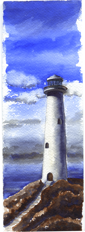
6″ x 9″ Arches 140lb rough, in my sketchbook. Paints mostly WN PB35 Cerulean, DS Bloodstone Genuine and Kyanite Genuine. There’s a touch of DS Sodalite Genuine for the darkest darks, and I can’t promise there isn’t a dash of DS Piemontite in the rocks as well. The scene is entirely made up, although I did check a few lighthouse refs to make sure the details were at least reasonably close to reality.
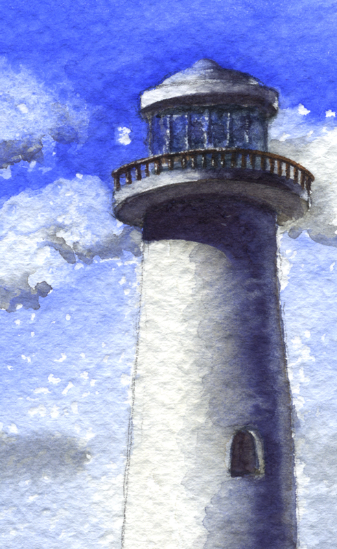
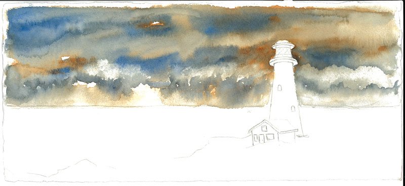 Went rooting through a paper drawer this weekend, and look what I found! Don’t remember when I started it, must have been 2013 or so. I recall being disappointed with the sky at the time and sort of abandoned the effort. Last night, it started looking good! Some paintings just need to age apparently. Now I like it – time to finish it!