A Study in Shadows

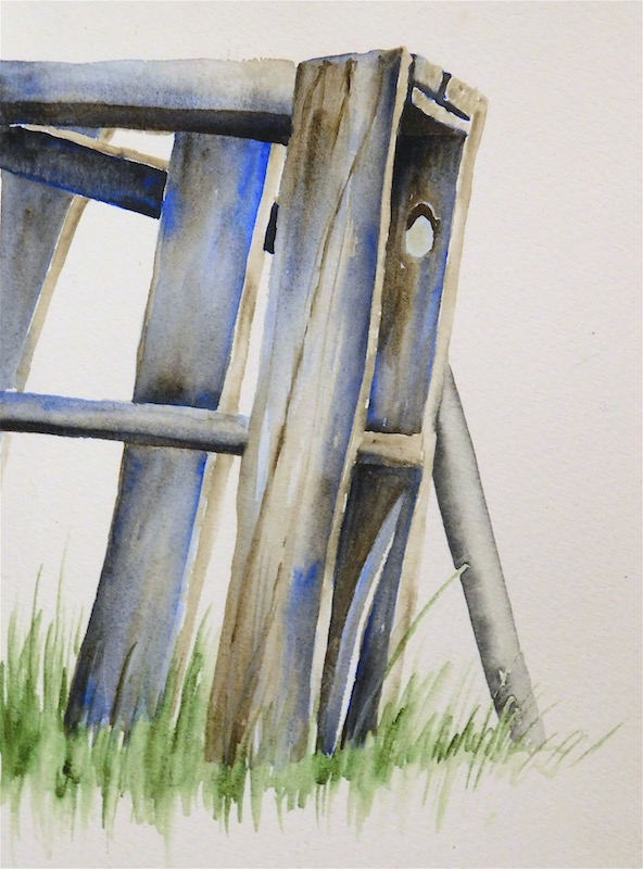
The sun found an old pallet this morning, and so did I. Fortunately it was just the right time for an irresistible display of shadows and lines!

The wood is rendered entirely in Raw Umber and Cobalt Blue mixed on the paper. Placing washes of pure color and letting them flow together naturally allows for soft grays to form, with a few saturated areas to keep it lively. The sawhorse leg behind is Daniel Smith’s Graphite, and a touch of Green Apatite forms the grass.

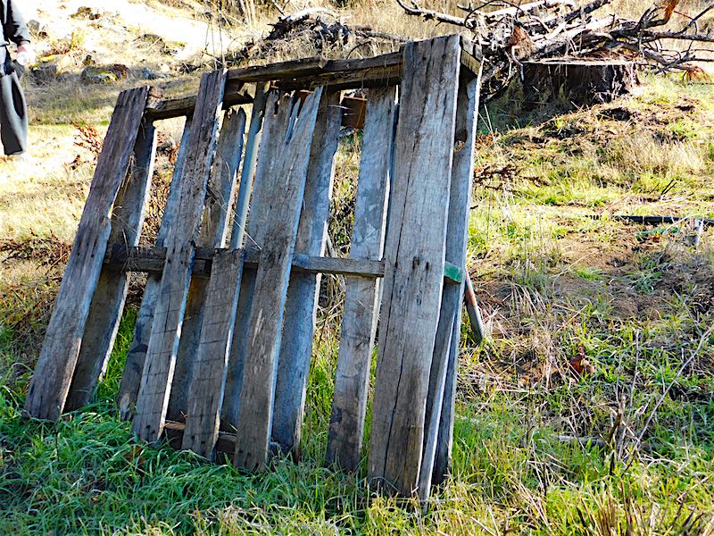
If you’re curious, here’s the rest of the pallet in context. Wish I’d had time to paint the entire scene!

Inktober 2016: Oct 16 – Garibaldi

101616-inktober-garibaldi-for-carol-final Garibaldi are the largest members of the Damselfish family, which surprised me. I’m only familiar with the smaller damselfish commonly found in people’s aquariums. Apparently Garibaldi are easy to find if you’re diving or exploring the sea with a glass-bottom boat. It’s hard to imagine something so colorful inhabiting our local waters!

101616-inktober-garibaldi-ink-onlyThis time I thought to scan the fish before painting it. It’s the largest drawing of Inktober 2016 so far and possibly the largest thing I have drawn all year. Someone offered me knitted socks in exchange for a Garibaldi painting – I figured if she was going to work that hard, I had better do the same! This fish takes up the entire 9″ x 12″ page from the Windpower pad. I put down the base drawing with the Kuretake #40 ink brush using several reference images. Now, on to the paint!   Read more

Inktober: Oct 11 – Toco Toucan

101116-inktober-toco-toucanThe crab left an odd gap on my page, so I found something that would fill it right up. The Toco Toucan gets the job done! He’s mostly ink, with some color obviously on the head, feet, and that incredible beak. (Funny thing about toucans. Their bills are large, but not very powerful. It can be hard for them to crunch up a grape!) This one has a wash of PO62 Benzi Orange on the eye spot and beak, with a further wash of PO73 Pyrrole Orange to deepen the color, and PB28 Cobalt Blue to give a little shadow. The feet are PB28/PO62 mixed on the paper. Finally, there’s a streak of PBr7 Burnt Umber on the branch.

Background is PV19 Rose Deep and PB16 Phthalo Turquoise. Those two are an odd combination and I hated it for a minute. The turquoise is far too green to normally make a good purple, and I should have known that. Fortunately it smoothed out into a decent-looking red-violet. Drawn with the Kuretake #40 brush.

Reference photo from Wikipedia.

Inktober 2016: Oct 7 – Blue Damselfly

100716-inktober-blue-damselfyI was fascinated with these insects as a kid! Always wanted to catch them, but someone told me they would bite, so I rarely even tried. Probably a good thing for the poor bugs I believed that tale!

Apparently this is a European damselfly, Enallagma cyathigerum. I would have seen Familiar Bluets, Enallagma civile. They’re all gorgeous, and always a treat when one lands nearby. This sketch began plein aire, since a Bluet landed while I was sketching the Bird of Paradise a few days ago. Of course it flew off a few seconds later! I found a photo taken from a similar angle and finished it up for Day 7. Not sure I love the Jadeite on the plant stem, but pretty happy with the rest of it.

TIL: Damselfly heads are really complicated! After finishing I realized that it actually has five pieces: two eyes of course, and three apparent sections between the eyes. In the ref, the left eye is nearly hidden. In the drawing, I sort of mixed up the left eye and the sections of the upper head. Might have to draw a damselfly head study to make up for my carelessness.


Inktober: Oct 6 – Kestrel Portrait

100616-inktober-kestrel-head-portraitLove these birds! Saw one as a teenager and thought it was pretty cool to have a genuine Bird of Prey living right in my boring neighborhood.

Learned a couple things with this drawing. One, watch proportions! The head shape and eye size is a little different than the reference. It’s fine for practice, but not entirely *right*. Second, never use paint to do what you should have done with ink. I tried to get lazy and beef up one of the black neck stripes with Sodalite, and it just looked weird. Better to have just scratched away at it a little longer.

Third, perhaps, plan ahead. I was going to draw the entire bird and could see after a while that maybe 60% of him would fit on the page by the time I got done. Oops. Head portrait it is! This was about all I had time to draw anyway. Might do a full-bird drawing and stretch it over two days.

Reference is this Wikipedia photo.

Sentries

071516-Courtyard-PalmsThe queen palms serving as sentries for the mighty Date Palm. This is a favorite spot of mine in the landscaping, and these palms always seem so majestic. The viewpoint is a little below grade, from down among the blocks in the water feature. The decorative grasses are only about a foot tall, but I’m eye level to them here.

Laid out with the Kuretake #40 brush pen initially, then washed with color. The foremost palm frond and a few other points employ gouache, although the highlights on the date palm trunk are saved whites. Painted across the spread in my sketchbook.

Cobalt blue, green apatite, some PO62 to mute the blue and Jane’s gray mix for the background black glass building. The palm trunks are Raw Umber (with and without cobalt) and there’s a little PY129 and Naple’s Yellow among the greenery. Oh, and the shrubs are Jadeite. Nine pigments – no limited palette here! At least not for me.

Magnolia Blossom

051716-magnoliaThere’s magnolia trees outside at at work. There was also a magnolia tree next door to the house I grew up in. Without my realizing it, that aroma seeped its way into my memories each year and became the olfactory theme for for late spring/early summer.

The first spring at this building I walked out the front door and immediately found myself feeling like school was about to let out. It’s  a wonderful feeling, even if I only get to enjoy it for a lunch break!


A Fine Spring Morning in Dystopia

041716-razor-wire-yardThis has been on my list for a while now. It’s the corner of the industrial property where I have studio space – the management recently saw fit to install a new fence with razor wire around the top. This amuses me to no end, because it’s really not a bad neighborhood at all. It looks all dystopian and prison-yardy though, and ensures that nothing short of birds, lizards, or very determined commandos can possibly be invading from that side of the property. Add some sun to create fabulous swirly shadows, and I can’t resist!

Read more

Beach House

121315-Sunset-Bch-HouseHad a rare opportunity to really put some time into a plein aire painting today. I spent most of the day working on this, from a very careful base sketch to laying in all the paint. The house really is shaped like a paralellogram! It’s old, it’s built right on the beach and it has obviously settled over the decades. To be honest, I’d love to live in it. That third floor has a window looking over the sea – guess which room would be my studio?

Read more

Sunset Evening

120515-Sunset-TankersAh, the tankers at sunset. Spent a lovely hour or two sketching while the sun went down. We were there late enough for the tankers’ lights to come on, so I dabbed those in with a bit of Bleedproof White. Otherwise, that’s cobalt, PO62, and a dash of PO73.

Tankers were not the only thing in view this evening – in addition to the usual birds and porpoises, I made friends with a beetle.
Read more