Inktober: Oct 12 – Snowy Egret and Bonus Cattails

101216-inktober-egret-1 101216-inktober-reeds-2
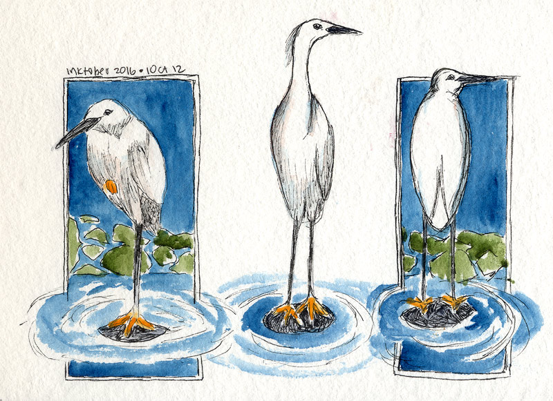
Walked over to a different corporate park to check out their landscaping for a change. This park has an enormous manmade pond, big enough to support giant koi and to attract a variety of wildlife. Today, across the sand volleyball court, I spotted a Snowy Egret in the middle of the lake.

There’s some lily pads and pond equipment out there. The bird was standing on a pipe or something that was just at the surface, making it look like the bird was standing on the water. Several ducks were doing the same on other pipes. I stole quietly across the volleyball court, hoping the reeds would hide my approach. Shouldn’t have worried!   Read more

Inktober: Oct 11 – Toco Toucan

101116-inktober-toco-toucanThe crab left an odd gap on my page, so I found something that would fill it right up. The Toco Toucan gets the job done! He’s mostly ink, with some color obviously on the head, feet, and that incredible beak. (Funny thing about toucans. Their bills are large, but not very powerful. It can be hard for them to crunch up a grape!) This one has a wash of PO62 Benzi Orange on the eye spot and beak, with a further wash of PO73 Pyrrole Orange to deepen the color, and PB28 Cobalt Blue to give a little shadow. The feet are PB28/PO62 mixed on the paper. Finally, there’s a streak of PBr7 Burnt Umber on the branch.

Background is PV19 Rose Deep and PB16 Phthalo Turquoise. Those two are an odd combination and I hated it for a minute. The turquoise is far too green to normally make a good purple, and I should have known that. Fortunately it smoothed out into a decent-looking red-violet. Drawn with the Kuretake #40 brush.

Reference photo from Wikipedia.

Inktober: Oct 10 – Fiddler Crab

101016-inktober-fiddler-crabThis is a female Fiddler Crab. They’re not hard to find at aquarium stores, and I’ve had more than one as pets. Interesting creatures! The males have one very large claw that is waved about (to attract the females of course.) All of them are busy, curious, and entertaining as they prowl around their tank looking for food. Unfortunately, they’re usually sold as freshwater creatures. Read more

Inktober: Oct 9 – Tibia Fusus

100916-inktober-tibia-fususHere’s a Tibia fusus shell. These are one of my favorite shells! I placed one on the drafting table and drew it.

The background color is one of my favorite blues ever, which I rarely use because the paint fades so badly. No clue what pigment it is, was some very old Grumbacher Academie tube that has long since been thrown away. Just one well in my palette remains, trotted out for special occasions that don’t require lightfastness. Other paints used are Raw Sienna/Burnt Sienna (PBr7), Ultramarine PB29 in the shadows on the shell, and PB60 for the ground shadow.

Switched tools and drew this with the Kuretake #40 brush pen, same Carbon ink as before. 8″ x 2.25″ approximately.

Inktober: Oct 8 – Ladybug

100816-inktober-7-spot-ladybug…because who can resist a ladybug? Like damselflies, they also have very complicated heads. Fun to draw though, even with so much detail. Drawing shiny stuff with ink does light my fire, and there was a remarkable amount of shadows and subtle highlights to consider. I’d intended to draw the entire ladybug, and (as I do) started it way too big, which meant it would have been running over the Kestrel just a half-inch above. Oops. Proportion seems to be an ongoing challenge for me.

Read more

Inktober 2016: Oct 7 – Blue Damselfly

100716-inktober-blue-damselfyI was fascinated with these insects as a kid! Always wanted to catch them, but someone told me they would bite, so I rarely even tried. Probably a good thing for the poor bugs I believed that tale!

Apparently this is a European damselfly, Enallagma cyathigerum. I would have seen Familiar Bluets, Enallagma civile. They’re all gorgeous, and always a treat when one lands nearby. This sketch began plein aire, since a Bluet landed while I was sketching the Bird of Paradise a few days ago. Of course it flew off a few seconds later! I found a photo taken from a similar angle and finished it up for Day 7. Not sure I love the Jadeite on the plant stem, but pretty happy with the rest of it.

TIL: Damselfly heads are really complicated! After finishing I realized that it actually has five pieces: two eyes of course, and three apparent sections between the eyes. In the ref, the left eye is nearly hidden. In the drawing, I sort of mixed up the left eye and the sections of the upper head. Might have to draw a damselfly head study to make up for my carelessness.


Inktober: Oct 6 – Kestrel Portrait

100616-inktober-kestrel-head-portraitLove these birds! Saw one as a teenager and thought it was pretty cool to have a genuine Bird of Prey living right in my boring neighborhood.

Learned a couple things with this drawing. One, watch proportions! The head shape and eye size is a little different than the reference. It’s fine for practice, but not entirely *right*. Second, never use paint to do what you should have done with ink. I tried to get lazy and beef up one of the black neck stripes with Sodalite, and it just looked weird. Better to have just scratched away at it a little longer.

Third, perhaps, plan ahead. I was going to draw the entire bird and could see after a while that maybe 60% of him would fit on the page by the time I got done. Oops. Head portrait it is! This was about all I had time to draw anyway. Might do a full-bird drawing and stretch it over two days.

Reference is this Wikipedia photo.

Inktober: Oct 5 – The Key Clip

100516-inktober-copper-clipIt was getting late last night, so I decided to draw a tiny thing. Here’s the copper clip off of the keys from Oct. 3. It’s a little larger than life size, whole thing is about 1″ x 2″. Still ended up being some good unwinding time. Strathmore 140lb CP Windpower paper, Platinum EF pen, Platinum Carbon ink.

Inktober: Oct 4 – Bird of Paradise

1004116-inktober-bopI think I’m in love with pen and ink.

This Bird of Paradise was drawn, and mostly painted, on location at lunchtime. There’s loads of these in the corporate landscaping; I was able to grab a chair from the cafe patio and get into some detail. The backlit sepals looked like stained glass! Approx. 4″ x 7″, same paper/ink as the others.

The pen was running out of ink toward the end of this sketch, but held out until the finish. Painted the flower itself on location and laid in the background (and a couple of touchups) at home. I didn’t plan to go all Halloween with the purple and orange, but kind of glad I did. PV23 is so deep, it helps set off the glow from the fiery sepals. Think I got the backlighting right – that doesn’t always turn out as intended for me.


Inktober: Oct. 3 – Keys

100316-inktober-keysThink this sketch got a little dark! I put some keys on the drafting table and drew them, so it’s like a mini-still-life. They were reflecting a lot more light on the upper parts, which I darkened trying to get contrast between one and the next. Not the best choice, but oh well. That’s what this is about, practicing and improving.

PV23 and PB29 for the background, Raw Sienna PBr7 on the keys, with a judicious dash of PV23 in the shadows. PR101 on the key ring. About 3″ x 3.5″ with the same ink, paper, pen as the wren.