Inktober 2016: Oct 20 – Leaves

102016-inktober-leaves
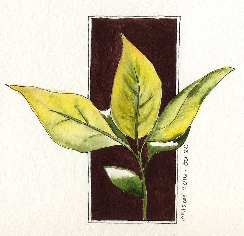
A quick lunchtime plein aire of bright new leaves. Yes, that’s new leaves – no idea what kind of tree this is, but it makes new leaves and flowers in the fall. Whatever it is, it reminds me of an avocado tree, and the top of it is an easy target from my favorite space in the parking structure. Add some sunshine to backlight them, and I could not resist!

That rich color behind it is Daniel Smith’s Piemontite. Leaves are a combo of PY154 yellow and Green Apatite with a dash of Piemontite to pick up the “new leaf” redness visible on the brand-new foliage. It was first outlined with the Kuretake #40 ink brush, so I’m counting it in for Inktober.

Inktober 2016: Oct 17 – Wet Grass

101716-inktober-grass-dropletsNot much to this sketch – it rained for the first time in months and I had to commemorate that somehow! These blades of grass had been intriguing me for weeks anyway. They were choking out the ornamental grasses in my favorite sketching corner. All of that dancing and waving in the breeze was making me want to draw them anyway; a few sparkly waterdrops finally made them irresistible. Approx 6.5″ x 4.5″ on Strathmore Windpower 140lb CP.

Inktober: Oct 12 – Snowy Egret and Bonus Cattails

101216-inktober-egret-1 101216-inktober-reeds-2Walked over to a different corporate park to check out their landscaping for a change. This park has an enormous manmade pond, big enough to support giant koi and to attract a variety of wildlife. Today, across the sand volleyball court, I spotted a Snowy Egret in the middle of the lake.

There’s some lily pads and pond equipment out there. The bird was standing on a pipe or something that was just at the surface, making it look like the bird was standing on the water. Several ducks were doing the same on other pipes. I stole quietly across the volleyball court, hoping the reeds would hide my approach. Shouldn’t have worried!   Read more

Inktober: Oct 4 – Bird of Paradise

1004116-inktober-bopI think I’m in love with pen and ink.

This Bird of Paradise was drawn, and mostly painted, on location at lunchtime. There’s loads of these in the corporate landscaping; I was able to grab a chair from the cafe patio and get into some detail. The backlit sepals looked like stained glass! Approx. 4″ x 7″, same paper/ink as the others.

The pen was running out of ink toward the end of this sketch, but held out until the finish. Painted the flower itself on location and laid in the background (and a couple of touchups) at home. I didn’t plan to go all Halloween with the purple and orange, but kind of glad I did. PV23 is so deep, it helps set off the glow from the fiery sepals. Think I got the backlighting right – that doesn’t always turn out as intended for me.


Sentries

071516-Courtyard-PalmsThe queen palms serving as sentries for the mighty Date Palm. This is a favorite spot of mine in the landscaping, and these palms always seem so majestic. The viewpoint is a little below grade, from down among the blocks in the water feature. The decorative grasses are only about a foot tall, but I’m eye level to them here.

Laid out with the Kuretake #40 brush pen initially, then washed with color. The foremost palm frond and a few other points employ gouache, although the highlights on the date palm trunk are saved whites. Painted across the spread in my sketchbook.

Cobalt blue, green apatite, some PO62 to mute the blue and Jane’s gray mix for the background black glass building. The palm trunks are Raw Umber (with and without cobalt) and there’s a little PY129 and Naple’s Yellow among the greenery. Oh, and the shrubs are Jadeite. Nine pigments – no limited palette here! At least not for me.

Sketchbook #11: Il Fornaio again

060816-SB-11-il-fornaioHere’s another take on Il Fornaio. This time I wanted to capture the forest of umbrellas that shade their enclosed patio. Didn’t even notice, until deep in the sketch, that one of the umbrellas was a different shape than the others. I used a bit of Bleedproof White with PV23 to lay in the flower blossoms over the background. It was tempting to add a few silhouette diners behind the glass, but something told me that would go too far and I’d ruin it. Decided to listen for once and stopped, so here it is.

Magnolia Blossom

051716-magnoliaThere’s magnolia trees outside at at work. There was also a magnolia tree next door to the house I grew up in. Without my realizing it, that aroma seeped its way into my memories each year and became the olfactory theme for for late spring/early summer.

The first spring at this building I walked out the front door and immediately found myself feeling like school was about to let out. It’s  a wonderful feeling, even if I only get to enjoy it for a lunch break!


Il Fornaio, then and now

0041916-Il-FornaioThought I would take a break from the courtyard people and sketch this restaurant at lunch. It’s a sit-down place with a quick-serve sandwich shop off to one side – this is the door to the shop. I found a lovely shady spot on the open patio and soaked up some fresh spring air, and painted away.

Just for grins, take a look after the jump for my take on the same shop from early 2012.  Read more

A Fine Spring Morning in Dystopia

041716-razor-wire-yardThis has been on my list for a while now. It’s the corner of the industrial property where I have studio space – the management recently saw fit to install a new fence with razor wire around the top. This amuses me to no end, because it’s really not a bad neighborhood at all. It looks all dystopian and prison-yardy though, and ensures that nothing short of birds, lizards, or very determined commandos can possibly be invading from that side of the property. Add some sun to create fabulous swirly shadows, and I can’t resist!

Read more