Inktober: Oct 6 – Kestrel Portrait

100616-inktober-kestrel-head-portrait
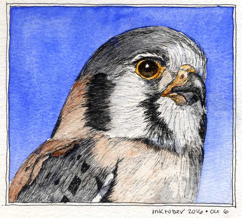
Love these birds! Saw one as a teenager and thought it was pretty cool to have a genuine Bird of Prey living right in my boring neighborhood.

Learned a couple things with this drawing. One, watch proportions! The head shape and eye size is a little different than the reference. It’s fine for practice, but not entirely *right*. Second, never use paint to do what you should have done with ink. I tried to get lazy and beef up one of the black neck stripes with Sodalite, and it just looked weird. Better to have just scratched away at it a little longer.

Third, perhaps, plan ahead. I was going to draw the entire bird and could see after a while that maybe 60% of him would fit on the page by the time I got done. Oops. Head portrait it is! This was about all I had time to draw anyway. Might do a full-bird drawing and stretch it over two days.

Reference is this Wikipedia photo.

Inktober: Oct 5 – The Key Clip

100516-inktober-copper-clipIt was getting late last night, so I decided to draw a tiny thing. Here’s the copper clip off of the keys from Oct. 3. It’s a little larger than life size, whole thing is about 1″ x 2″. Still ended up being some good unwinding time. Strathmore 140lb CP Windpower paper, Platinum EF pen, Platinum Carbon ink.

Inktober: Oct 4 – Bird of Paradise

1004116-inktober-bopI think I’m in love with pen and ink.

This Bird of Paradise was drawn, and mostly painted, on location at lunchtime. There’s loads of these in the corporate landscaping; I was able to grab a chair from the cafe patio and get into some detail. The backlit sepals looked like stained glass! Approx. 4″ x 7″, same paper/ink as the others.

The pen was running out of ink toward the end of this sketch, but held out until the finish. Painted the flower itself on location and laid in the background (and a couple of touchups) at home. I didn’t plan to go all Halloween with the purple and orange, but kind of glad I did. PV23 is so deep, it helps set off the glow from the fiery sepals. Think I got the backlighting right – that doesn’t always turn out as intended for me.


Inktober: Oct. 3 – Keys

100316-inktober-keysThink this sketch got a little dark! I put some keys on the drafting table and drew them, so it’s like a mini-still-life. They were reflecting a lot more light on the upper parts, which I darkened trying to get contrast between one and the next. Not the best choice, but oh well. That’s what this is about, practicing and improving.

PV23 and PB29 for the background, Raw Sienna PBr7 on the keys, with a judicious dash of PV23 in the shadows. PR101 on the key ring. About 3″ x 3.5″ with the same ink, paper, pen as the wren.

Inktober: Oct. 2 – Bob Tarte’s Sedge Wren

100216-inktober-sedge-wrenToday’s entry is a serenading Sedge Wren, drawn from Bob Tarte’s fabulous photo and used with his generous permission. Thanks Bob! Do check out his books and podcast at bobtarte.com.

Birdy at left drawn with the Platinum EF fountain pen on Strathmore 140lb Windpower CP.

Found: Lighthouse in Progress

Boulder Point Lighthouse IPWent rooting through a paper drawer this weekend, and look what I found! Don’t remember when I started it, must have been 2013 or so. I recall being disappointed with the sky at the time and sort of abandoned the effort. Last night, it started looking good! Some paintings just need to age apparently. Now I like it – time to finish it!

I wondered if this was the lighthouse at Orfordness in East Anglia, but the tops are different. This must therefore be a made-up lighthouse, probably as an excuse to paint the dramatic sky.

Another Lighthouse Paper Test: Fabriano Cold Press

100714 Fabriano CP lighthouse test_CCI find lighthouses are irresistible subjects when I want to test some paper… there is no better excuse to paint a sky!

This is some 140lb Fabriano Cold Press that I’m considering for the next sketchbook. Have been using various brands of 140lb rough for the last three books and decided to change it up a bit. I like using something different in each, keeps me from getting stagnant.

Read more

The Great Blue

The-Great-Blue-081214Testing a free sample of Garza Papel. I’m in love!! They have a standing offer for free samples, which I highly recommend if you’ve never used their paper. Now that I’ve tried it, I’m dying to purchase and make a sketchbook out of it… have to save up first though. It will be worth it.

Cobalt blue PB28 and Burnt Sienna PBr7. I mixed the samples up accidentally, this one feels like 140lb CP. It’s about 5.5″ x 7.5″.

The reference was a Great Blue Heron, although the red came on too strong and it’s looking more like a Little Blue Heron. Oh well. No base sketch, I just went right in with a wet brush, for the challenge.

Originally posted on WetCanvas.com.

Lighthouse Paper Test

042214-Lighthouse-detail042214-Lighthouse-paper-testPaper test! The first washes looked really good, so I decided to finish it up. PB28, PO62, and PBr7 Burnt Umber. It’s 12″ x 4″ on 140lb Fabriano Artistico Rough.

And yes, I love the paper!

Stormcloud Doodle

020214-Storm-Doodle-w-lighthouseI was inspired by some stormclouds the other day and painted a sketch of them. PB28 Cobalt and PO62 benzimidazolone orange. Mostly washed on as pure color + let the laws of physics do the magic. (I did mix a little on the palette for the very deep accents in the clouds. ) Added the lighthouse after it was dry, I just couldn’t stop seeing one there so had to do it. About 5″ x 7″ on a loose piece of 140lb paper, probably the Richeson stuff I don’t really like. Worked well here though!