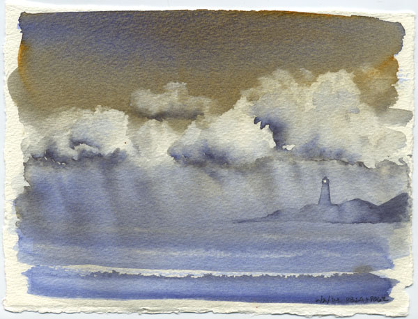
 That storm doodle sketch inspired me to try it again on a quarter sheet. Same two colors, same method, same laws of physics – totally different results! This is a cropped version, hiding a really prominent breaking wave at the bottom that was just bugging me as soon as I’d painted it.
Artwork
Paintings, drawings, calligraphy, illustration, and other individual pieces (excluding sketchbook entries).
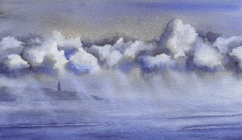
Stormcloud Doodle
 I was inspired by some stormclouds the other day and painted a sketch of them. PB28 Cobalt and PO62 benzimidazolone orange. Mostly washed on as pure color + let the laws of physics do the magic. (I did mix a little on the palette for the very deep accents in the clouds. ) Added the lighthouse after it was dry, I just couldn’t stop seeing one there so had to do it. About 5″ x 7″ on a loose piece of 140lb paper, probably the Richeson stuff I don’t really like. Worked well here though!
California Door
 Testing Twinrocker rough. (Conclusion? I like it. I really really like it. I may have to start affording it. )
8″ x 10″ from their sample pack, bright white paper. Maimeri Blu PB29 and PR101, and DS PO48.
This is a made-up door, very typical of California cookie-cutter condos (with their mishmash of architectural styles) and blazing summer sun. The iron decoration is from the wall of a nearby apartment building.
Originally posted on WetCanvas.com
Last Light on the Aspens
 Apparently my muse wants to go camping! A made-up scene inspired by all the pretty fall photos I’ve been seeing. 6″x9″ on Arches 140lb rough, PB60/PO48 with PO73, PY150, PY129 and a random splash of PG7 in the foliage.
Very pleased with the foreground shrubs, which are somewhat inspired by Roland Lee (a masterful painter of skies as well.)
I might do a larger version.
Originally posted on WetCanvas.com.
Pebble Sand – Demo
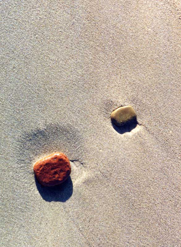 I’ve been digging through scads of old photos this weekend, scrounging for reference pics. Found a few winners, including this shot of some pebbles on the lakeshore in Chicago, taken on vacation in 1998.
I wanted to keep a limited palette and also explore the sand-creating possibilities of the best granulator I know: Daniel Smith Genuine Purpurite. This stuff is so granular it’s almost best not to really paint with it, as much as dab it on and let the water float it around.
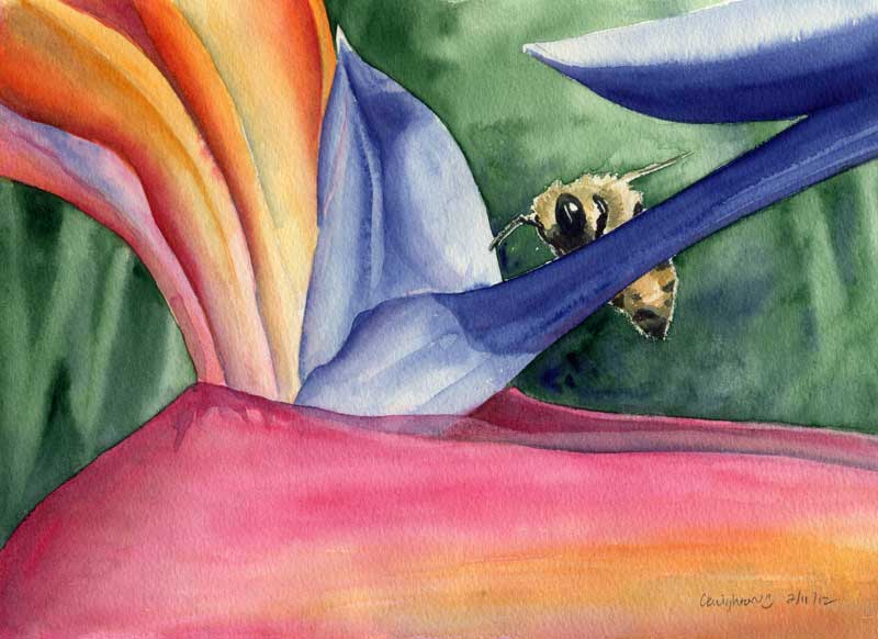
Bee Mine
 A quick test to see if I like Richeson 140lb CP paper:
7.5″ x 11″, though I cropped the scan slightly on the right to get the bee in a happier position. Indanthrone blue, perinone orange, and quin rose, with a homemade “hookers” green in the background (prussian blue and ni azo yellow.)
This bee was checking out the Bird of Paradise flowers at a local college campus while I was there to shoot reference pics. Painted this in 2011 and sent it to my Dad, so this is Round 2. Seemed like the last time it was a *lot* more work, what a difference a year makes!
Conclusion: Yes, I like the paper. Now I need to see if I like the back. If yes, that’s good because it’s time for a new sketchbook.
Originally posted on Wetcanvas.com