 Spent several hours this morning at the beach. Some kids were playing jump rope with a piece of giant kelp that washed up, meanwhile I was doing this.
Nature
The Great Blue
 Testing a free sample of Garza Papel. I’m in love!! They have a standing offer for free samples, which I highly recommend if you’ve never used their paper. Now that I’ve tried it, I’m dying to purchase and make a sketchbook out of it… have to save up first though. It will be worth it.
Cobalt blue PB28 and Burnt Sienna PBr7. I mixed the samples up accidentally, this one feels like 140lb CP. It’s about 5.5″ x 7.5″.
The reference was a Great Blue Heron, although the red came on too strong and it’s looking more like a Little Blue Heron. Oh well. No base sketch, I just went right in with a wet brush, for the challenge.
Originally posted on WetCanvas.com.
Stormcloud Painting
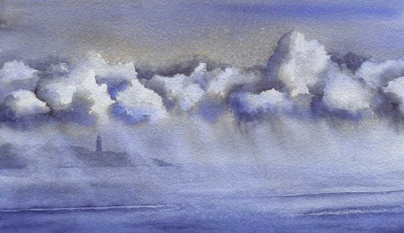 That storm doodle sketch inspired me to try it again on a quarter sheet. Same two colors, same method, same laws of physics – totally different results! This is a cropped version, hiding a really prominent breaking wave at the bottom that was just bugging me as soon as I’d painted it.
Stormcloud Doodle
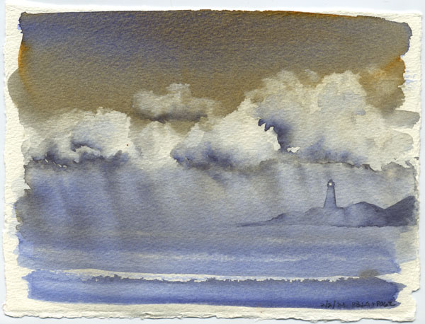 I was inspired by some stormclouds the other day and painted a sketch of them. PB28 Cobalt and PO62 benzimidazolone orange. Mostly washed on as pure color + let the laws of physics do the magic. (I did mix a little on the palette for the very deep accents in the clouds. ) Added the lighthouse after it was dry, I just couldn’t stop seeing one there so had to do it. About 5″ x 7″ on a loose piece of 140lb paper, probably the Richeson stuff I don’t really like. Worked well here though!
Approaching Storm
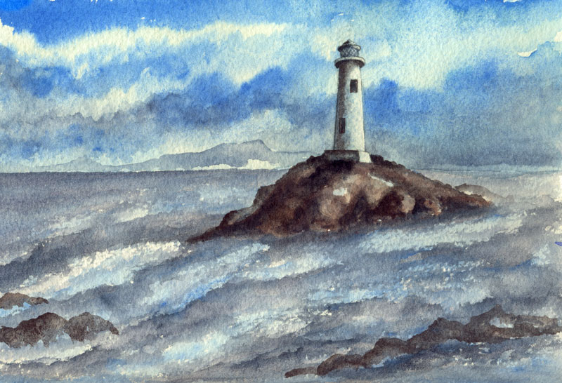 This sketch started around Christmas as an exercise in painting water, and was supposed to be a boulder in a wild running stream. I put down the boulder and the Kyanite (the silvery-gray color) then got bored and moved on.
This week I decided that I was never going to paint the riverbank above the rock, so used the blank top half to practice a cerulean sky. This made the water look like the sea, except it needed a reason to be reflecting all that gray! That led to a storm moving in. A Monthly Challenge on WetCanvas.com, plus a film I’d seen, got me thinking about lighthouses. There was no reason why the boulder couldn’t be a small rocky island, so made a few adjustments, and there we are.
This is just a wee bit brighter IRL, but not much… there’s sort of cool haze to it, as if the light is weak and watery and all but snuffed out by the incoming weather. Funny experience, I was laying in the bottom of the clouds and the line looked more like the top of a mountain, and I actually thought, “Oh, look! A land mass!”
6″ x 9″ Arches 140lb rough, in my sketchbook. Paints mostly WN PB35 Cerulean, DS Bloodstone Genuine and Kyanite Genuine. There’s a touch of DS Sodalite Genuine for the darkest darks, and I can’t promise there isn’t a dash of DS Piemontite in the rocks as well. The scene is entirely made up, although I did check a few lighthouse refs to make sure the details were at least reasonably close to reality.
Last Light on the Aspens
 Apparently my muse wants to go camping! A made-up scene inspired by all the pretty fall photos I’ve been seeing. 6″x9″ on Arches 140lb rough, PB60/PO48 with PO73, PY150, PY129 and a random splash of PG7 in the foliage.
Very pleased with the foreground shrubs, which are somewhat inspired by Roland Lee (a masterful painter of skies as well.)
I might do a larger version.
Originally posted on WetCanvas.com.
Pebble Sand – Demo
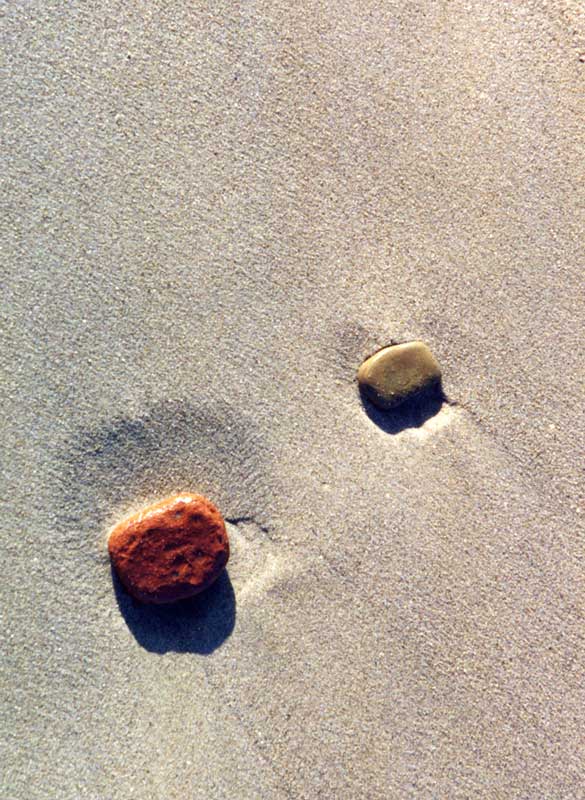 I’ve been digging through scads of old photos this weekend, scrounging for reference pics. Found a few winners, including this shot of some pebbles on the lakeshore in Chicago, taken on vacation in 1998.
I wanted to keep a limited palette and also explore the sand-creating possibilities of the best granulator I know: Daniel Smith Genuine Purpurite. This stuff is so granular it’s almost best not to really paint with it, as much as dab it on and let the water float it around.